Skip to content

Curb Appeal, Brand and Return on a Vestibule

What a storefront vestibule does for how people see your business, and how to tell if it's paying off.

Your entrance is part of the brand

On a busy block, people pass a storefront in seconds. The entrance has to catch their eye and make them feel welcome fast. A well designed vestibule turns a flat storefront into a clear destination. It frames the door, adds depth to the facade, and gives people an obvious path from the sidewalk inside.

It sits right where people decide whether to come in or keep walking. Step inside one and you're out of the wind and rain, in a calmer pocket of air, with less street noise and a clear way in. Those small comforts add up to a sense that the place takes care of its guests, and people tend to connect that with quality.

The look sends a message too. Guests notice whether the vestibule is bright or dark, clean or scuffed, and whether its colors and style match what they see inside. When all of that lines up, the business feels more polished before anyone reaches the counter.

It adds practical space as well: room to organize pickup orders without blocking the door, a place for a line to form, and somewhere for delivery drivers to wait.
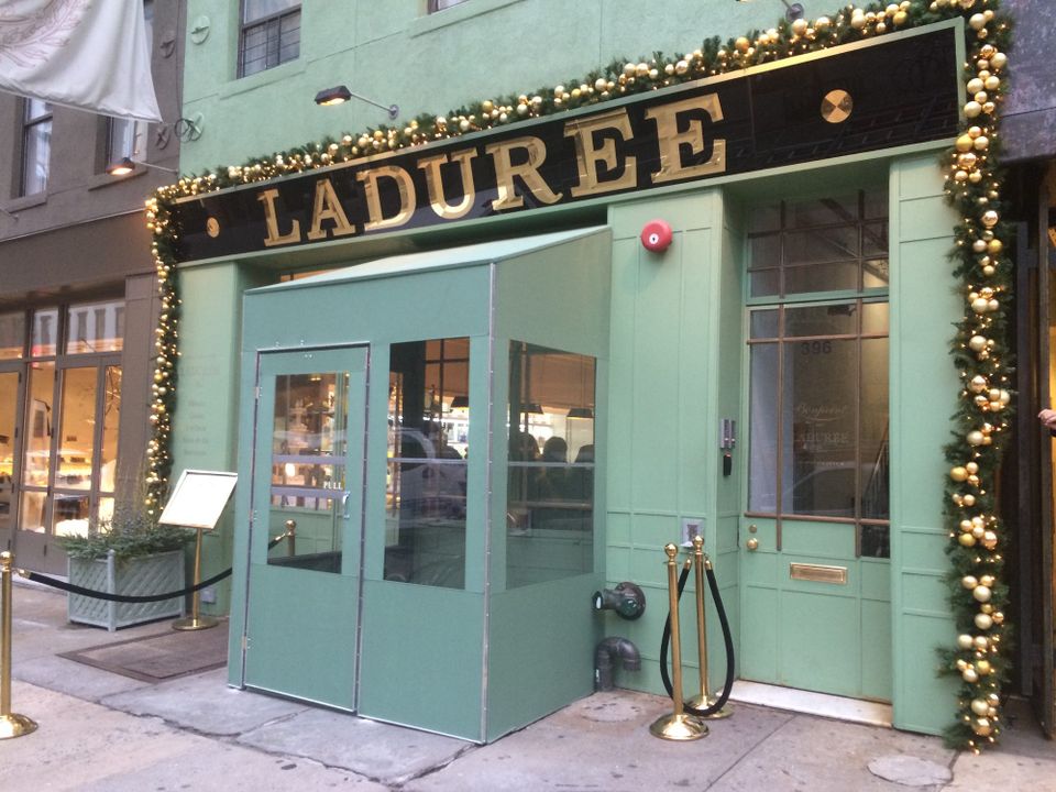
Mint green custom vestibule with glass panels and a double door at the Ladurée storefront, matched to the facade color beneath gold dimensional lettering

Designing for curb appeal

A vestibule is functional, but it's also a big part of how the storefront reads from the street. The elements that matter most:
 
  • Color that matches or complements the brand and the interior
  • A name that's visible from more than one angle
  • Soft, even lighting so the entry feels safe and warm at night
  • Windows or clear panels that keep the view inside open

Materials change both the look and how it holds up. Fabric gives a softer, classic look, rigid panels feel more modern, clear vinyl or glass keeps it bright, and metal framing adds strength.

Treat the surfaces like a small billboard: the logo on the side or front panels, lettering that's easy to read and still on style, and a short line about the cuisine or the hours so people passing can decide quickly. When the sign, the awning and the vestibule all match, the storefront stands out on a crowded block without shouting.
View Our Vestibules

What a before-and-after looks like

These are typical situations, not specific jobs, and they show how much the entrance changes the way people see a business.
 

A small bistro with a bare doorway

The food is great and the room is cozy, but the door opens straight onto the sidewalk. Cold air reaches the back tables, people crowd the doorway, and on the coldest days a taped-up plastic enclosure appears that blocks the view inside. A permanent vestibule with clear glazing, slim dark framing that echoes the interior, and simple door vinyl with the logo and hours changes all of it. People can see the room from the sidewalk, guests have somewhere to wait, and the entrance finally matches the dining room.
 

A fast-casual spot with a cluttered front

The glass is covered in small stickers and signs, a thin temporary vestibule goes up crooked every winter, and the lunch line spills onto the sidewalk. A custom vestibule with clear glass at eye level and frosted lower panels, framing color matched to the awning, and a backlit sign office workers can spot from down the block turns the front into one clean design. Inside, there's room for a short line and a separate pickup spot.
 

A neighborhood café people walk past

Regulars love it, but from a few doors away it reads like a blank storefront. A compact vestibule sized for the narrow sidewalk, with full height glazing, warm toned framing that ties into the wood inside, a small projecting sign on the corner, and simple coffee cup and pastry icons on the door, gets people to notice it.

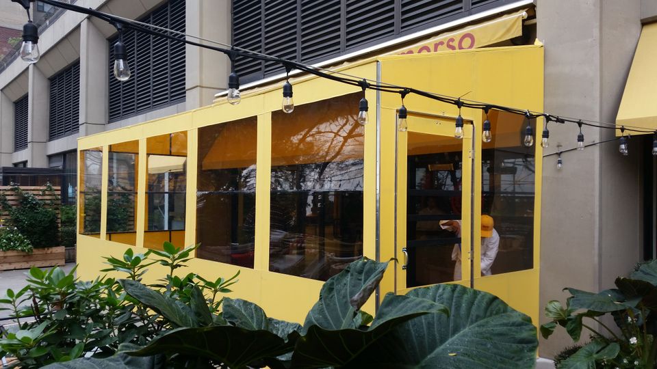
Yellow seasonal vestibule with clear vinyl panels enclosing a restaurant entrance Morso in New York City

A story that changes with the seasons

A good vestibule works year round. In summer it helps keep the air conditioning inside. In winter it stops cold wind from reaching the tables, the waiting area or the register. In spring and fall it gives people a dry place to open or shake off an umbrella.

It's also a storytelling space you can update without starting over. Summer graphics can push cold drinks or welcome first-time visitors. As it cools down, warmer colors and softer graphics signal comfort inside. In between, quick swaps of vinyl panels or window graphics can mark back to school, a big sports season or a neighborhood event.

Printed graphics, window film with patterns or taglines, QR codes that lead to a menu or booking page, and rotating messages for specials all give people another reason to look.
Brushed aluminum vestibule with a glazed door built inside a retail store entrance, photographed from the sales floor

Replacing an old revolving door

Many older buildings are phasing out revolving doors. They break down and cost money to repair, they're awkward for strollers, wheelchairs and carts, they confuse visitors, and when one jams, the line backs up onto the sidewalk.

A vestibule with two sets of doors does the same job of limiting air exchange. When one door opens, the other stays closed, so winter wind and summer humidity don't flood the lobby and the front area stays comfortable for the staff who work there.

It also gives you something a revolving door never did: a place for the brand. Match the framing and trim to the brand colors, put the name on the glass or panels in clean lettering, and use backlit or halo lit letters so it glows on short winter days. Soft lighting inside shows people where to step. Plan for separate paths in and out, accessible door widths, hardware and thresholds, door swings that keep people from bumping into each other, and room for a line at rush hour without blocking the sidewalk.

What drives the cost and the timeline

Every storefront is different, so it helps to think in levels of scope rather than fixed prices: a compact, simple vestibule for a narrow storefront, a standard one sized to a double door, or a larger design with glass, lighting and more detailed finishes.

The budget usually breaks down into design and permitting, materials and fabrication, installation and site work, branding and graphics, and optional extras like heaters, interior lighting or automatic door openers. Things that push it up:

 
  • More depth and width, and L-shaped or wrap-around layouts at corners
  • Glass, higher end hardware, custom colors and trim
  • Corner locations, uneven sidewalks, steps or tight clearance at the curb
  • Landlord requirements, union labor and historic district approvals

A typical project runs from a site visit and concept design, through landlord sign-off and any city requirements, to fabrication in the shop and installation on site. Demand climbs as soon as the weather turns, so planning in late summer or early fall beats waiting for the first snow. Making decisions on size, materials and layout early, and having measurements, photos and building rules ready, keeps things moving.

Measuring the return

To see whether a vestibule is paying off, collect four to six weeks of numbers before installation, then the same numbers for four to six weeks after, in a similar season. Keep pricing, hours and promotions steady during both periods, and avoid holiday swings so the comparison stays fair.

What to track:

 
  • Foot traffic: entries per day from a door counter, POS timestamps or manual counts at peak times, and especially what happens on cold or rainy days
  • Dwell time: the time between a ticket opening and closing in your POS
  • Conversion: visitors compared to sales, average daily revenue and average ticket size

Some signs won't show up in a spreadsheet: fewer guests standing in drafts, people waiting calmly in the vestibule instead of the doorway, and staff at the door who aren't freezing. Graphics inside the vestibule can help too, by showing seasonal specials, loyalty programs or where to order while people wait.

Frequently asked questions

How does a vestibule improve curb appeal?

It frames the doorway, adds depth to the facade and makes the entrance look like a clear destination. Good lighting, clean surfaces and branding help people feel confident walking in.


How can I measure the return on a new vestibule?

Collect four to six weeks of foot traffic, sales and dwell time data before installation and the same after, in a similar season. Pay extra attention to bad weather days.


What affects the cost of a vestibule in NYC?

Size, layout, materials, installation conditions, permits and extras. Compact vinyl or acrylic designs are generally more economical, while larger designs with glass, lighting, branding or premium hardware cost more.


What's the difference between a vinyl vestibule and a glass one?

Vinyl or acrylic is faster and more affordable to fabricate and still blocks weather and drafts. Glass looks more permanent and polished but needs heavier framing and hardware and a bigger budget.


Can a vestibule replace a revolving door?

Yes. Two sets of doors with a space between them limit air exchange the same way, while being easier for wheelchairs, strollers and carts and giving you room for branding and lighting.


What's the difference between a temporary winter enclosure and a permanent vestibule?

Temporary enclosures are often plastic, go up for the season and can look flimsy or block the view inside. A permanent vestibule uses durable glazing and framing, matches the storefront, and works year round.

Ready to upgrade your entrance?

Tell us about your storefront and what you'd like the entrance to do. We'll follow up to go over options and provide a clear, detailed quote.
Get a Quote