Skip to content

Street-Level Traffic Capture in NYC: Guide to Sign Placement and Sightlines

Learn how to boost street visibility and foot traffic with commercial signs in NYC using sightline checks, angle heuristics, and compliance tips for shops

Turn Passing Foot Traffic Into Paying Customers

New York sidewalks work like moving conveyor belts full of possible customers. If your storefront sign is easy to see and easy to read, some of those people step off that belt and walk through your door. If your sign is hidden, blocked, or poorly placed, they just keep moving.

We like to treat commercial signs in NYC as performance tools, not decoration. A good sign plan can affect how many people notice you, how many pause, and how many actually enter. That is why placement, angle, height, and lighting matter just as much as colors and fonts.

In this guide, we will walk through basic sightline rules, simple ways to map pedestrian flow, smart choices around corners and intersections, and key code and safety points. We will also touch on how vestibules and winter setups change what people see once the weather turns cold and the days get darker earlier.

 
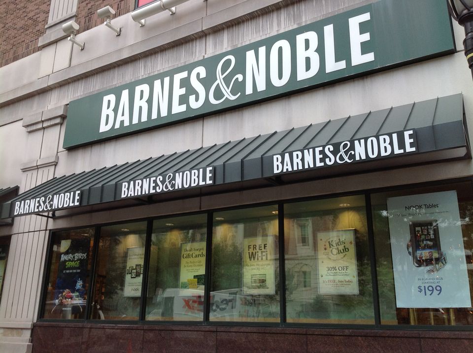
Barnes & Noble storefront with dimensional lettering above printed awning valances

How NYC Streets Shape What People Actually See

On paper, your storefront might look wide open. On the street, it is a different story. In New York, narrow sidewalks, parked cars, scaffolding, street trees, trash cans, and vendor carts all block or frame what people can see. Shorter daylight in fall and winter means more of your traffic happens in low light too.

Think about three main viewing zones as people approach your store:

 
  • Long-range approach, about 100 to 200 feet out
  • Mid-range decision zone, roughly 30 to 80 feet
  • Last-second capture, under 25 feet from your door

Here is how common sign types work in those zones:
 
  • Fascia signs on the main band above your storefront carry your name from mid to long range when the view is clear.
  • Blade signs that stick out perpendicular to the building are powerful in mid-range and last-second zones, especially on crowded blocks.
  • Awnings and canopies help at oblique angles when parked cars or scaffolding block lower views.
  • Vestibule graphics, door lettering, and window film serve the last-second zone and help guide people right into the entrance.

Vertical layering is key on busy sidewalks. Eye-level window graphics and door lettering speak to slow walkers and people standing close. Slightly higher blade signs help people see you over heads in a crowd. Higher canopy or awning faces can be seen under scaffolds and over vehicles, which is important when half the block is under construction or covered by sheds.

Sightlines, Approach Angles, and Intersection Heuristics

Most storefront traffic does not come straight on from the center of the block. People approach from different directions and heights, and each group sees something different as they move.

Common approach patterns include:

 
  • Along-the-block pedestrians walking with the flow on each side of the street
  • Corner crosswalk users coming from the intersection on both sides
  • People stepping out of buses, cabs, or ride-shares near the curb

Along-the-block walkers see your storefront at a shallow angle for a while, then more head-on near your door. Crosswalk users often first see only the edge of your space as they step off the curb. People exiting vehicles may have their view blocked by the car roof, nearby traffic, or other parked cars.

A few simple intersection heuristics help:

 
  • Aim your most important signs within about 30 to 45 degrees of the most common approach angles on each side.
  • Make sure at least one edge of a sign is visible from each crosswalk corner.
  • Keep key text and logos out of dead zones behind columns, deep recesses, or where door swings always block the view.

Technical sightline checks are simple but powerful. We suggest:
 
  • Put small tape marks on the sidewalk at 50, 75, and 100 feet from your door in both directions and toward each corner.
  • Stand at each mark at eye level and take photos facing your storefront, day and night.
  • Note when parts of your sign disappear behind cars, poles, trees, scaffolding posts, or bus shelters.

Repeat this once after the time change when evenings get darker earlier. You may see that a sign which feels bright at noon is almost lost at 5 p.m. without proper lighting.

Mapping Pedestrian Flow to Place Commercial Signs That Work

Good sign placement starts with knowing which side of the sidewalk really matters. That comes from simple, manual pedestrian-flow mapping. No fancy tech is required.

For at least a few days, pick time blocks like:

 
  • Morning rush
  • Lunchtime
  • Evening commute
  • Weekend afternoon

During each block, count how many people pass in each direction on your side of the street. Note which corner sends you more people, which crosswalk looks busier, and where people tend to pause or gather, for example at bus stops or food carts.

Then turn that flow data into real placement decisions for commercial signs in NYC:

 
  • Name your “capture side,” the direction and sidewalk edge that sends you the biggest volume.
  • Put your primary fascia or awning sign so it is most readable from that capture side at mid-range.
  • Place a strong blade sign close to the main flow line, not buried in a recess.
  • Use secondary window graphics and vestibule branding to repeat your name, hours, and entrance cue near eye level.

Seasonal shifts matter too. In colder months:
 
  • People wear hats and hoods, which cut peripheral vision, so clear, simple messages help.
  • Darker afternoons make unlit signs fade into the background, so consider lighting and higher contrast.
  • Temporary vestibules move the “real” entrance line outward, so branding on the enclosure needs to show your name and entry point.

Clear hours on doors or vestibule panels help hesitant customers feel sure you are open when it is dark or the weather is bad.
Grey dimensional letters reading Devoción mounted above a gated entrance on a painted dark grey brick facade

Balancing Visibility, Safety, and NYC Code Compliance

Visibility is only one side of the plan. Your signs also have to respect New York City code and basic safety guidelines. Local rules can affect:
 
  • How far a sign or awning can project over the sidewalk
  • Required clear height above the walking surface
  • When lighting is allowed or restricted
  • When permits and a licensed sign hanger are required

There are also practical safety points to keep in mind:
 
  • Choose mounting heights that keep edges and hardware out of the head strike zone.
  • Use hardware and anchors rated for outdoor wind loads and typical winter conditions.
  • Place awnings and vestibules so they do not block exit doors, stairs, or fire department equipment.

Good documentation saves time later. We often recommend keeping a simple folder with:
 
  • Sightline photos from your tape marks and intersection corners
  • Basic pedestrian-flow notes and sketches
  • Final drawings, materials, and mounting details for each sign, awning, or enclosure

This kind of record makes it easier to respond to landlord questions, insurance requests, or Department of Buildings reviews before the busy holiday season.

Turn Your Street Data Into a High-Impact Sign Plan

Once you have your photos, notes, and counts, turn them into a clear to-do list. Aim for specific actions instead of vague ideas. For example:
 
  • Add or relocate a blade sign so it shows clearly from your main capture side.
  • Adjust the height of your fascia sign so it clears parked vehicles but still feels tied to your storefront.
  • Add lighting or higher contrast to signs that disappear in late afternoon.
  • Put hours and simple branding on vestibules and at eye level on doors.

Work through each approach path and ask: From 100 feet, can people tell something is there? From 50 feet, can they read the name? And at the door, do they know where to enter?

At SignIt NY in Brooklyn, we spend a lot of time on this kind of real-world review. On-site, we look at sightlines from each sidewalk direction and crosswalk, watch actual pedestrian flow, and then recommend specific storefront signs, awnings, and vestibule graphics that match code while working with the way your block really moves. When commercial signs in NYC are treated like performance tools and shaped by real street data, everyday sidewalk traffic starts to feel a lot more like a steady stream of customers.

Get Started With Your Project Today

Transform your storefront into a powerful branding tool with our custom-designed commercial signs in NYC. At SignIt NY, we work closely with you to create signage that matches your vision, fits your location, and complies with city regulations. If you are ready to explore options or have questions about your project, just contact us and our team will guide you every step of the way.
Get a Quote