Skip to content

Storefront Signage That Pulls Foot Traffic

How a sign turns a passing glance into a visit.

The salesperson outside your door

On busy blocks like Fulton Street, Bedford Avenue and Downtown Brooklyn, people walk past your door all day. Some are hungry, some are running errands, some are killing time before a train. What they see from the sidewalk is the only way they know if you're the right spot.

A sign works like a salesperson that never goes off duty. In a couple of seconds it has to answer three questions: What is this place? Is it for someone like me? Is it worth stopping for right now? It keeps building recognition even when you're closed.

Visibility is the hard part. Narrow sidewalks, parked cars, scaffolding, trees and crowded corners all compete for attention. Size, placement and contrast matter more than most owners think. When the main sign, the awning, the window graphics and the vestibule all look like they belong together, people feel confident walking in. When each one is a different style, the storefront reads like a mismatched menu.
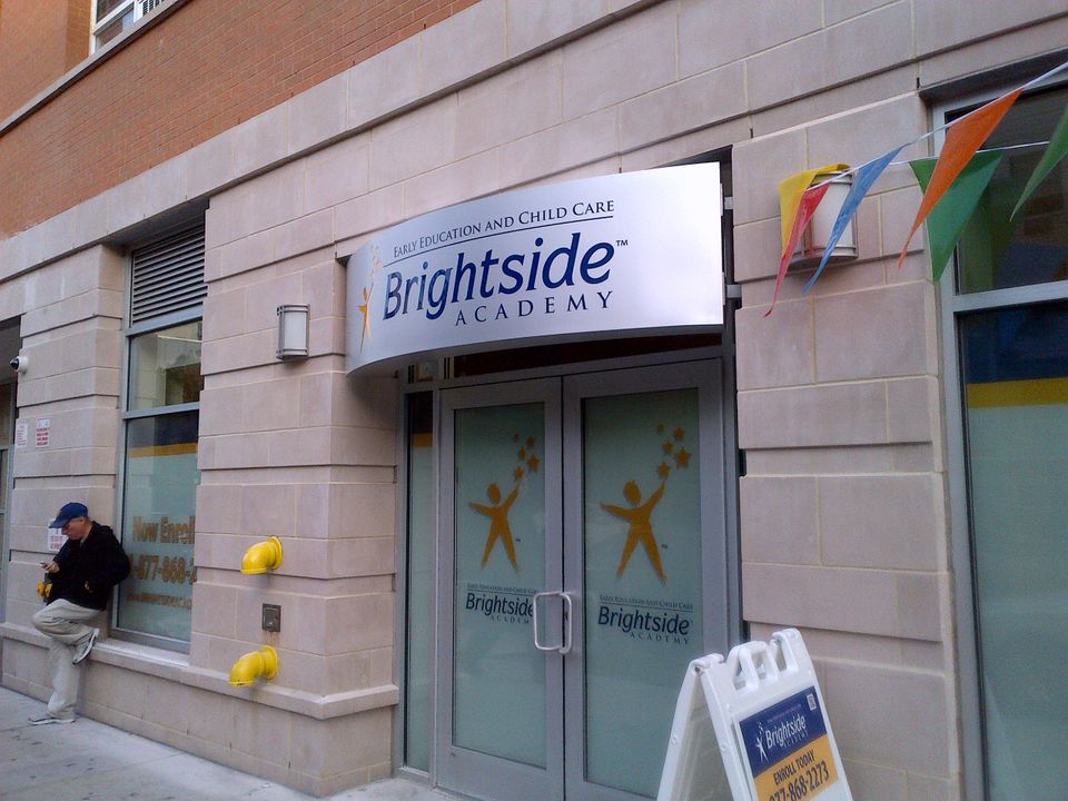
Curved white illuminated cabinet sign with a logo mounted over a double-door entrance

Readable in a glance, day and night

People on a sidewalk move at different speeds. Some stroll, some power walk, some rush by with headphones on. The sign has to reach all of them at once:
 
  • Letters tall enough to read from across the street, and taller the farther away people are
  • One or two simple fonts, nothing too thin or ornate
  • High contrast, like dark letters on a light background or the reverse

Lead the eye in order: the store name, then what you sell or your main offer, then a simple action like "Entrance" or key hours. When everything is the same size and color, nothing stands out. Tiny letters, paragraphs of text, phone numbers crammed into one panel and fancy script all vanish from across the street.

Summer sun washes out weak colors, so contrast has to hold up in glare. After dark, lighting keeps the sign working: backlit signs glow from within, halo lit letters cast a soft edge of light, and lighting under the awning washes the entrance. A sign that relies only on light from inside disappears as soon as the sun goes down.
See Our Light Boxes
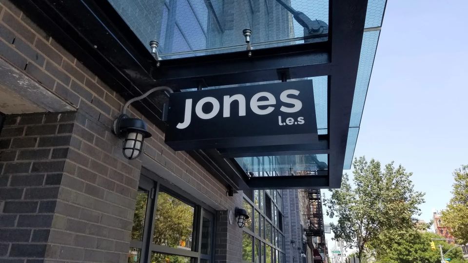
Black blade sign reading Jones L.E.S. hanging beneath a glass entrance canopy beside a wall light on the Lower East Side

The right sign types for busy sidewalks

Strong storefronts use a mix of sign types that work together instead of one sign on the wall.
 
  • Fascia signs and channel letters carry the name and the main branding. They should read from down the block and stand out against brick and brownstone.
  • Blade and projecting signs stick out from the building, so people walking along a narrow sidewalk see them from a distance without turning toward every window. They need enough height for head clearance, a size that's noticeable without blocking other signs, and a design that reads from both directions.
  • Awnings push your color out over the sidewalk, protect the entrance, and make the door easy to spot.
  • Window graphics and door lettering share hours, specialties and short messages where people walk closest. Keep the windows inviting, not crowded.
  • Vestibules keep cold air out in winter and cool air in during summer, so the doors can stay open longer.

The look should fit the street. Classic lettering and colors feel natural on historic blocks, bold modern designs suit warehouse areas, and playful layouts stand out near nightlife.
See Our Hanging Signs
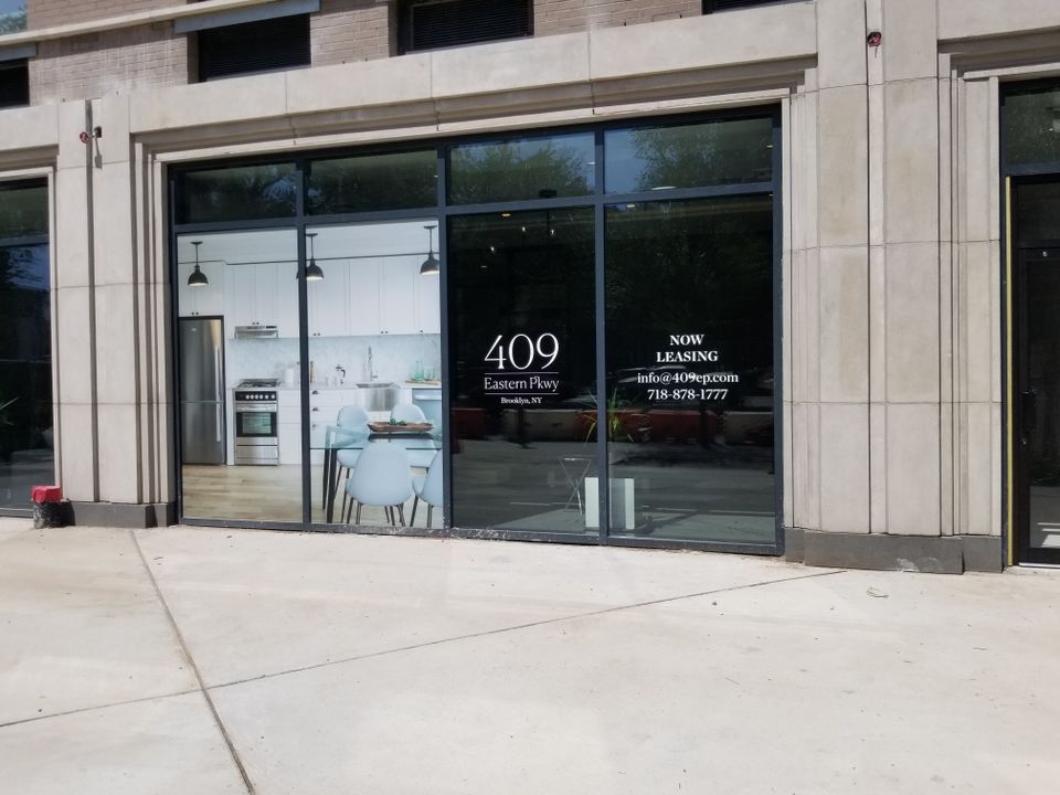
White cut-vinyl address logo and leasing details applied to a large storefront window

Wayfinding for shared buildings

Many Brooklyn buildings stack uses: retail downstairs with offices above, a café with co-working upstairs, a shop on the ground floor and medical suites on the second. When the signage isn't planned as one system, people walk past the main entrance, open the wrong door, never realize a business is upstairs, or assume it's closed because the hours are tiny or hidden.

The goal is to let a first-time visitor find the right entrance, see who's where, read the hours and know if it's accessible, all in about three seconds:

 
  • Make the main entry sign larger and bolder than everything else, with strong contrast and lighting
  • Add a directory panel by the main door listing tenants by floor or suite
  • Give each tenant one clear band on a shared awning, or a blade sign on a column or side wall
  • Put hours at eye level in the same spot on every door
  • Label step-free entrances, ramps and elevators, with arrows from a stepped door to the accessible one, and mark delivery doors plainly

A shared framework (one type style for building information, standard sign sizes, set locations for each tenant) lets every business keep its own look while the facade stays neat. Landlords get better curb appeal and fewer arguments over who gets the good spot.
See Our Vinyl Graphics

Placement that pays off

Where a sign sits matters as much as how it looks. On a busy corner, study the crosswalks, bike lanes, bus stops and subway exits, where people naturally slow down or cluster, and which side of the street gets more foot traffic. The main sign should be easy to see as people approach, not only when they're standing in front of it. Secondary signs near the door or windows catch people at the last moment.

Keep the sign consistent with your online presence, menus, packaging and interior signs, so people know they're in the right place the second they spot your logo or colors.

To see if it's working, watch walk-in traffic after a new sign or awning goes up, listen for "I saw your sign and came in," and look for seasonal changes, like more evening visits after adding lighting. If people walk past without glancing in, or seem unsure what you offer, it may be time for a refresh.

Built for Brooklyn weather and rules

Heat, UV, humidity and sudden thunderstorms take a toll. Signs fade in constant sun, warp or peel in heat, and take a beating from wind and heavy rain. Metal, acrylic, fabric and vinyl each handle weather differently, so the material should be chosen for how long it needs to look right, not just how it looks on day one.

Signs also have to follow Department of Buildings rules on size, placement and sometimes lighting, plus the landlord's requirements and, in some neighborhoods, landmark restrictions. Do-it-yourself signs and quick online orders often miss them: signs sized outside what's allowed, lighting that doesn't meet local rules, or mounting that isn't secure. The result can be fines, removal or delays right when you need to be open and visible.

Permits, landlord approvals and fabrication all take time, so start well before your busy season.

A quick sign check

Walk across the street and look at your store at a few different times of day:
 
  • Can someone read the store name instantly?
  • Is it clear what you sell or offer?
  • Is the sign readable in bright sun and at night?
  • Do the sign, awning, vestibule and window graphics match?
  • Does the storefront feel inviting, or easy to miss?

If any answer is no, there's room to improve.

Frequently asked questions

What makes a storefront sign easy to read from the street?

Large lettering, simple fonts and strong contrast between the text and the background, with a message short enough to understand in two or three seconds.
 

What's the difference between a fascia sign and channel letters?

A fascia sign mounts flat against the front of the building, often on a panel above the storefront. Channel letters are individual three dimensional letters that can be lit for more depth and visibility.
 

What's the difference between backlit signs and halo lit letters?

Backlit signs glow from within, lighting up the whole face. Halo lit letters cast light around their edges, creating a soft outline glow.


When should I use a blade sign?

On narrow or busy sidewalks, where people see storefronts from the side. A blade sign projects from the building so it can be read from both directions.


How can a shared building make its entrances easier to find?

Make the main entry sign the largest and boldest, add a tenant directory by the door, put hours in the same spot on every door, and clearly mark accessible and delivery entrances.
 

Do storefront signs in Brooklyn need permits?

Many do. Signs have to follow zoning rules and Department of Buildings requirements, and landmarked areas may need extra approval, so check before installing or replacing one.

Ready for a sign people notice?

Tell us about your storefront and the street it's on.
We'll follow up to go over options and provide a clear, detailed quote.
Get a Quote