Designing Storefront Signage That Stops People in Their Tracks
On a busy Brooklyn sidewalk, people move at different speeds. Some stroll, some power-walk, some rush with headphones on. Your signage has to speak clearly to all of them in one glance.
For strong visual hierarchy and readability, think about:
- Letter height large enough to read from across the street
- Clear, simple fonts that are not too thin or ornate
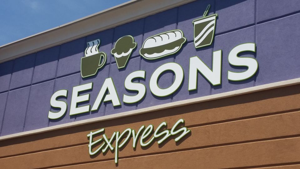
- High contrast between text and background, like dark letters on a light base or the opposite
The goal is simple: someone should be able to tell who you are and what you do in two or three seconds. Extra details are fine, but the main message must be obvious.
Brooklyn also has a strong sense of local character. Brownstone blocks, industrial loft areas, and new glass buildings each have their own feel. Your storefront should fit the street but still show your brand personality. For example:
- On historic blocks, more classic lettering and colors can feel natural
- In warehouse-style areas, bold, modern designs may match the setting
- Near creative or nightlife districts, playful or artistic layouts can stand out
Nighttime visibility is just as important as daytime. With summer nightlife and late store hours, lighting can keep your signage working:
- Backlit signs that glow from within
- Halo-lit letters that create a soft edge of light
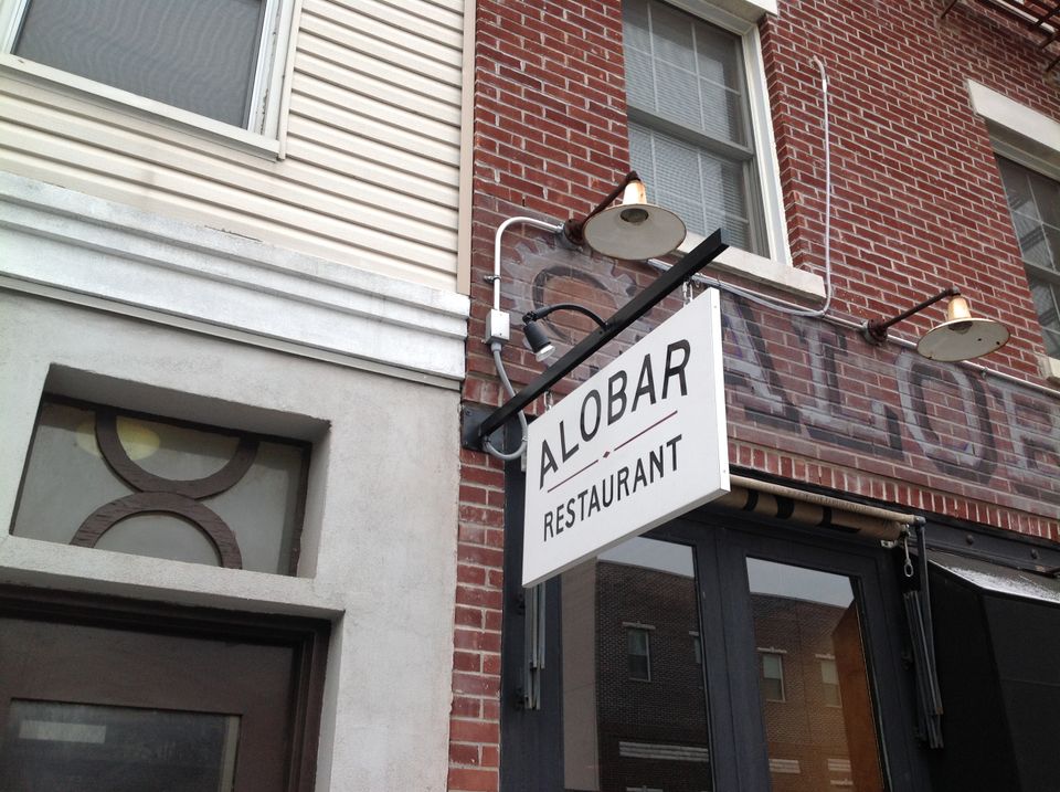
- Awning lighting that washes your entrance and sidewalk in warm, welcoming light
Thoughtful lighting does more than help people read; it makes your storefront feel open and active after dark.