Skip to content

Common Vestibule Mistakes to Avoid

The problems we see most often at New York City entrances, and what to do instead.

When the entrance turns people away

A cold wind, a light rain and a drafty entrance can be enough for someone to skip your door and walk into the shop next door. In New York, people decide from the sidewalk, and an entrance that looks cold, cramped or confusing loses them in seconds.

A vestibule is there to block wind, rain and street noise, especially in the in-between months when the weather changes by the hour. Done well, it keeps the room comfortable, protects the staff up front and makes the storefront look finished. Done badly, it hurts the brand, slows foot traffic and can even cause code problems.

The same mistakes come up again and again, and almost all of them are avoidable.
Black framed seasonal vestibule with double glass doors at a New York City building entrance, snow on the sidewalk

Mistake 1: Ignoring code and ADA rules

New York has strict rules for anything that sticks out onto the sidewalk. The mistakes we see most:
 
  • Vestibules that narrow the sidewalk too much in a busy area
  • Doors or panels that block or crowd an emergency exit path
  • Too little room inside for turning and passing
  • Door openings too narrow for wheelchairs or strollers

The result isn't just an awkward entrance. It can mean violations from city agencies, an order to remove the enclosure, fines, complaints from neighbors, and more risk if someone gets hurt at the door.

Accurate measurements, any required permits, and a layout planned around the existing doors prevent all of it. The enclosure has to fit the building, respect the sidewalk and still give people with mobility devices an easy way in and out.
View Our Vestibules
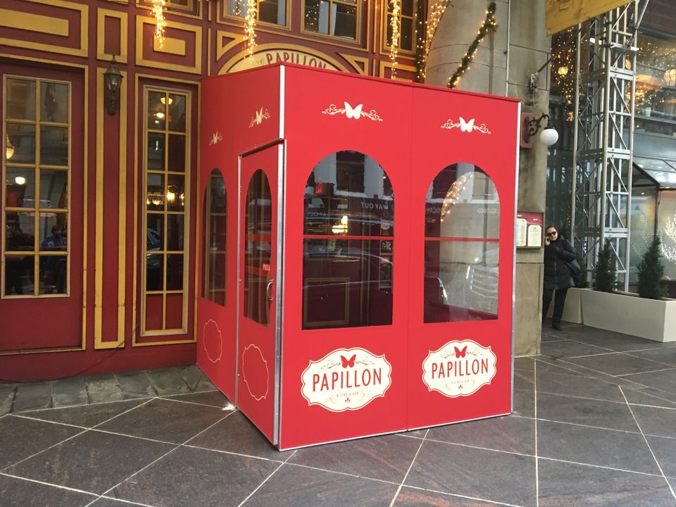
Red painted vestibule with arched windows and branded oval logo panels at an ornate building entrance

Mistake 2: A vestibule that fights the brand

The vestibule is often the first thing people see up close. When it looks like a random box stuck on the front of the building, it sends the wrong message. The usual culprits are colors that clash with the sign or awning, fonts that don't match the logo or the interior, a logo placed too low, too high or off to one side, and solid panels covering the display windows.

A vestibule should look like part of the storefront. Planned together with the sign and the awning, it makes the entrance easier to spot from down the block, gives you a clean surface for branding and directions, carries seasonal messages without clutter, and frames the doorway so it feels warm and inviting. The more it matches your colors, fonts and style, the more it tells customers this is a place that cares about details.
Glass paneled winter enclosure with a black aluminum frame running the length of a waterfront restaurant deck

Mistake 3: The wrong materials for the weather

One week feels like winter, the next like summer, and there's always a chance of hard rain, strong wind or blazing sun on the entrance. The wrong materials show it fast:

Cheap clear plastic that yellows and clouds
Thin vinyl that flaps or tears in the wind
Metal frames that rust along the bottom edge
Weak hardware that loosens from daily use

Besides looking bad, that makes the vestibule noisy, drafty and sometimes unsafe. Better choices mean clear panels that stay easy to see through, fabric or vinyl that holds up to tension and wind, framing that keeps its shape under heavy use, and hardware that keeps the doors aligned and smooth. UV stable panels, wind resistant details and easy-to-clean surfaces keep the vestibule looking sharp season after season.

Mistake 4: Forgetting how
people move through it

A vestibule should protect people, not trap them. Poor layouts slow everything down:
 
  • Doors that swing into the main sidewalk flow
  • Tight corners that are hard to get through with bags or a cart
  • No room for a short line inside at busy times
  • Door placement that confuses first-time visitors

Comfort suffers too, with drafts shooting straight into the room, heat building up on sunny days with no ventilation, and a dark, cramped feel that makes people rush through.

A better layout plans for how people actually move: doors that swing naturally, a straight, open path from the sidewalk to the counter, room for strollers, wheelchairs and shopping bags, and sightlines that make the entrance feel safe and open. Customers should feel like they're stepping into a calm pocket of the store, not a crowded box.

Mistake 5: Treating it as a temporary afterthought

A lot of businesses put up a quick winter vestibule, use it hard, then leave it season after season with no plan. The warning signs are faded or peeling graphics, cloudy vinyl, broken zippers or gaps that let in wind and rain, and loose seams or panels flapping in the breeze. From the sidewalk, it makes the whole storefront look tired.

A well planned system is modular so it can come down and go back up, uses hardware built for repeat use, stores easily off season, and is simple to refresh with new branding. A check before the wet and cold months catches small problems early, whether that means repairing panels, tightening hardware, updating graphics or redesigning part of the enclosure to fit the business as it is now.

Step outside and look at your entrance the way a first-time visitor would. Is it clear how to get in? Does it feel dry, bright and safe? Does it match the rest of the storefront?

Frequently asked questions

Do I need a permit for a storefront vestibule in New York City?

Often, yes. Anything that extends onto or affects the public sidewalk can trigger city permitting and rules. Accurate measurements and a planned layout help prevent violations, fines or an order to remove it.


What are common ADA mistakes with vestibules?

Door openings that are too narrow and interiors without enough room for a wheelchair or stroller to move. A vestibule that blocks an exit path or makes turning and passing difficult creates access problems and safety risks.


How can a vestibule hurt my branding?

It can look like a random box if it clashes with your sign, awning colors, fonts or logo placement. Solid panels over display windows or a confusing layout also make the storefront less inviting.


What materials hold up best?

Clear panels that resist yellowing, stronger framing, and durable hardware that stands up to rain, wind, sun and heavy foot traffic. Cheap plastic clouds, thin vinyl tears, and weak hardware loosens with daily use.


How often should a vestibule be checked?

At least once before the wet and cold months. Look for cloudy panels, loose seams, broken zippers, gaps that let in wind and rain, and faded graphics.


Time to rethink your entrance?

Tell us about your storefront and what isn't working at the door.
We'll follow up to go over options and provide a clear, detailed quote.
Get a Quote